OSTREVENT HABITATBrand Identity — Construction & Renovation
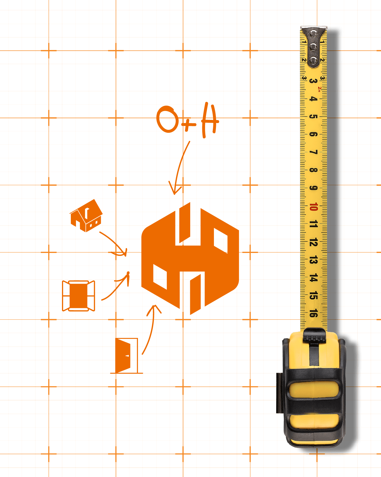
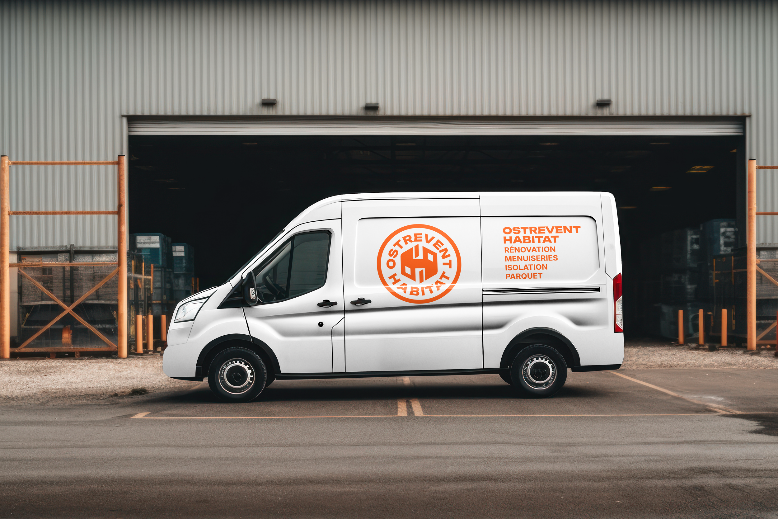
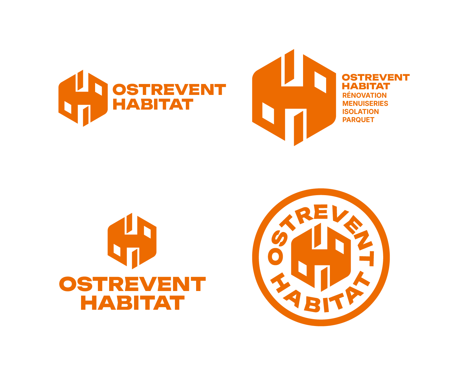
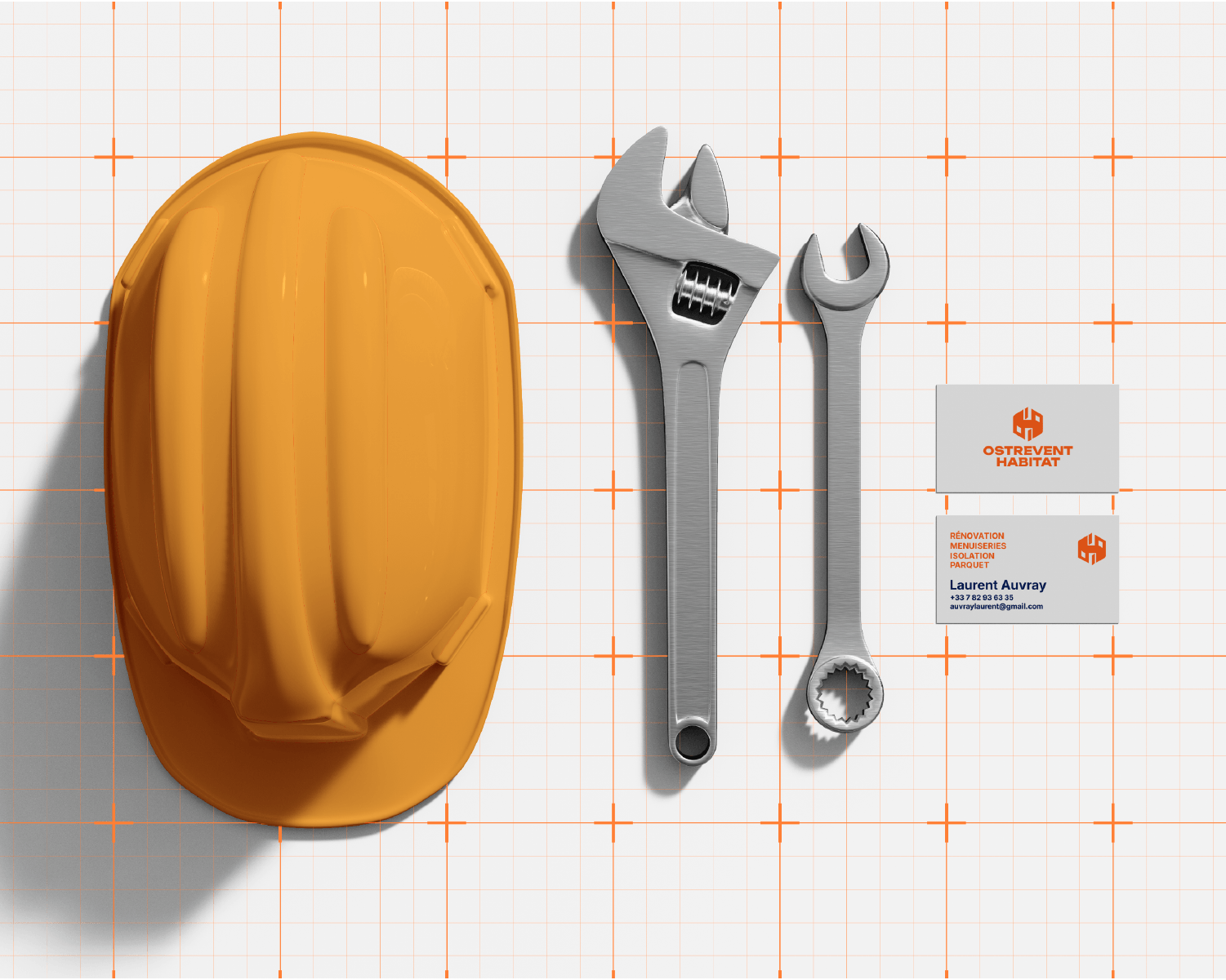
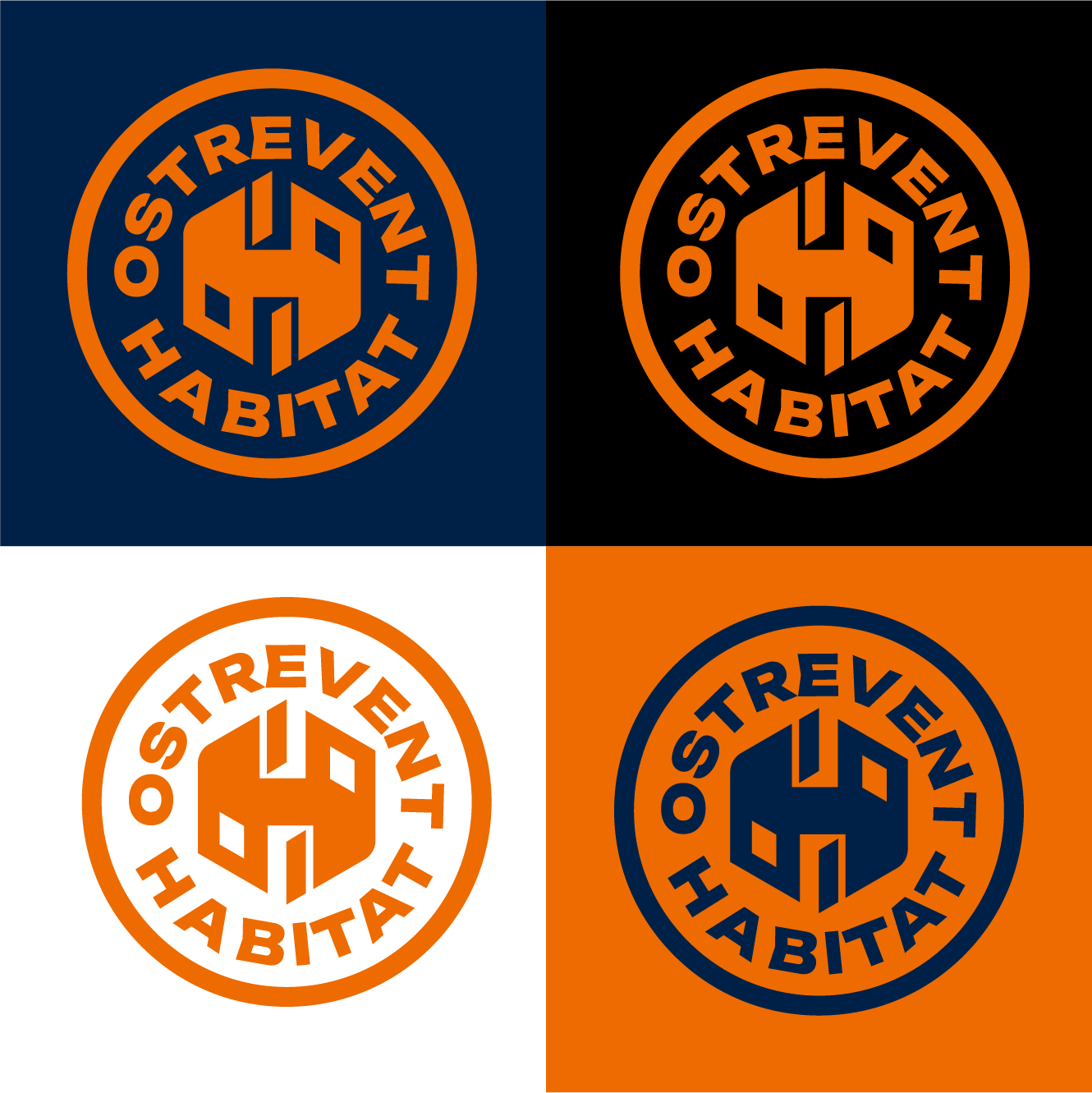
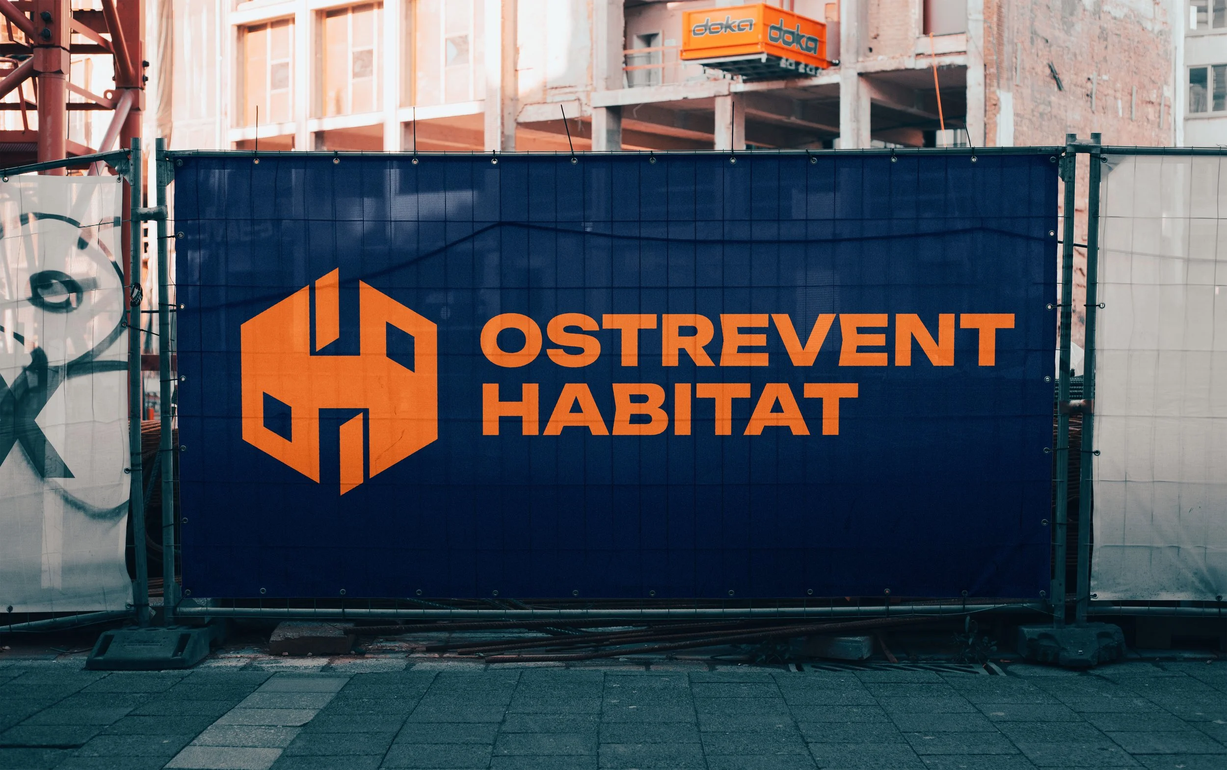
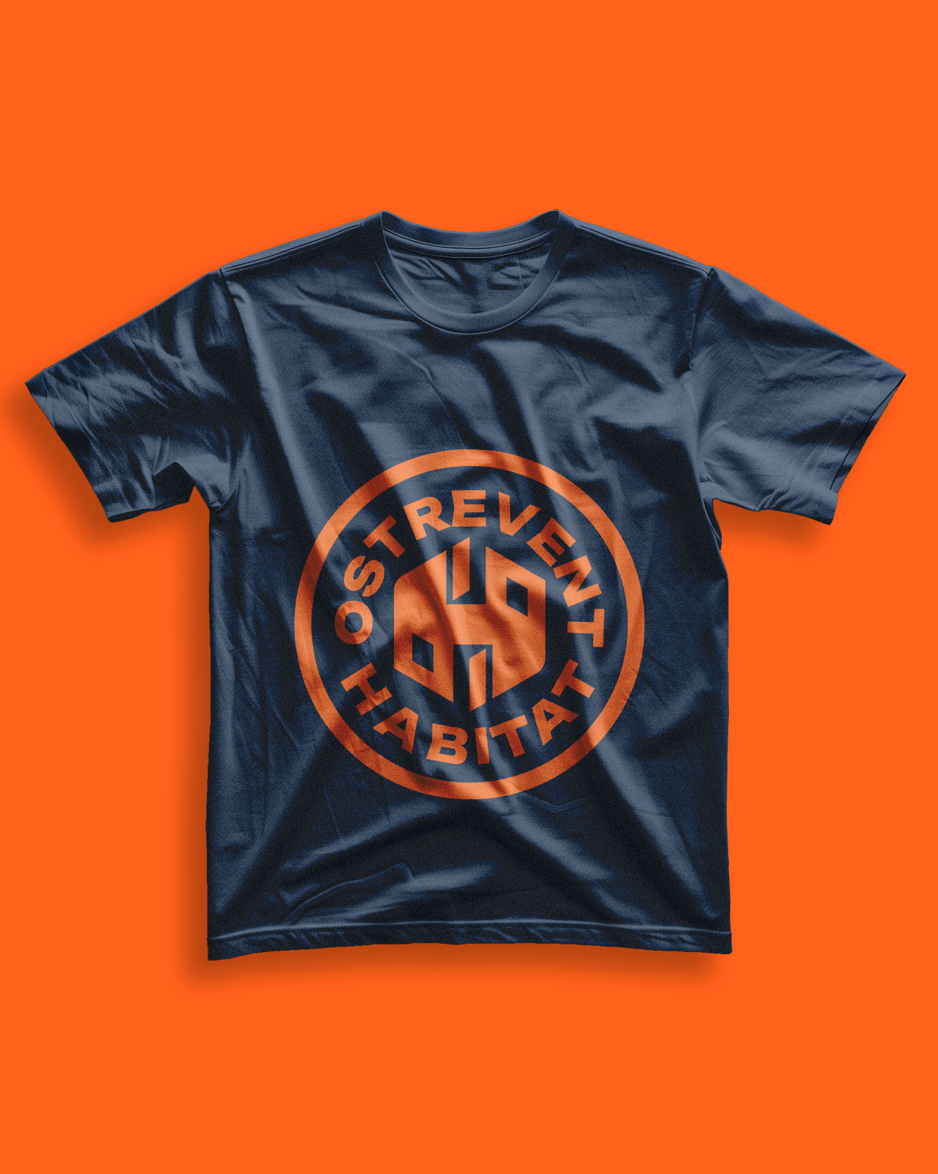
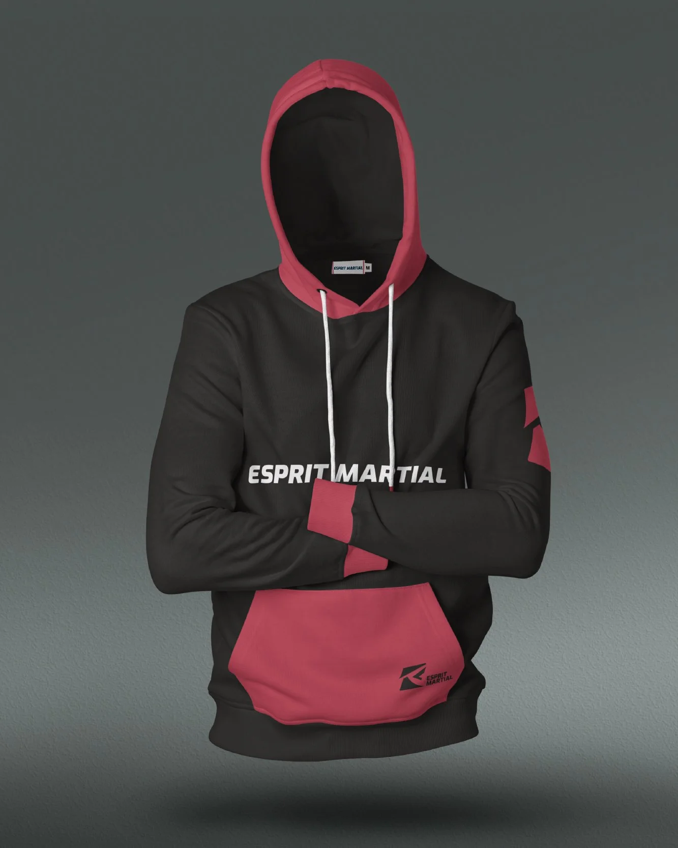
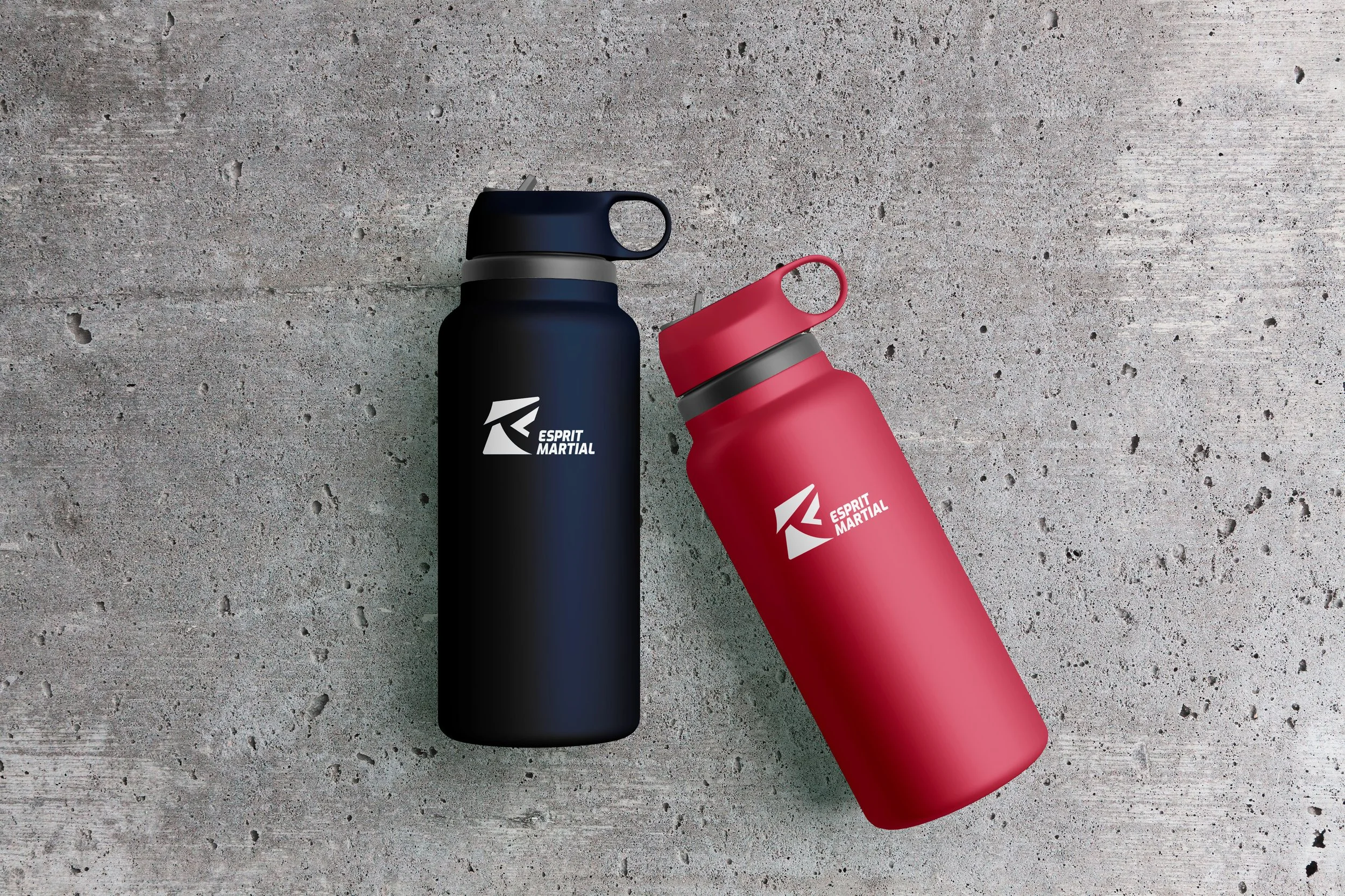
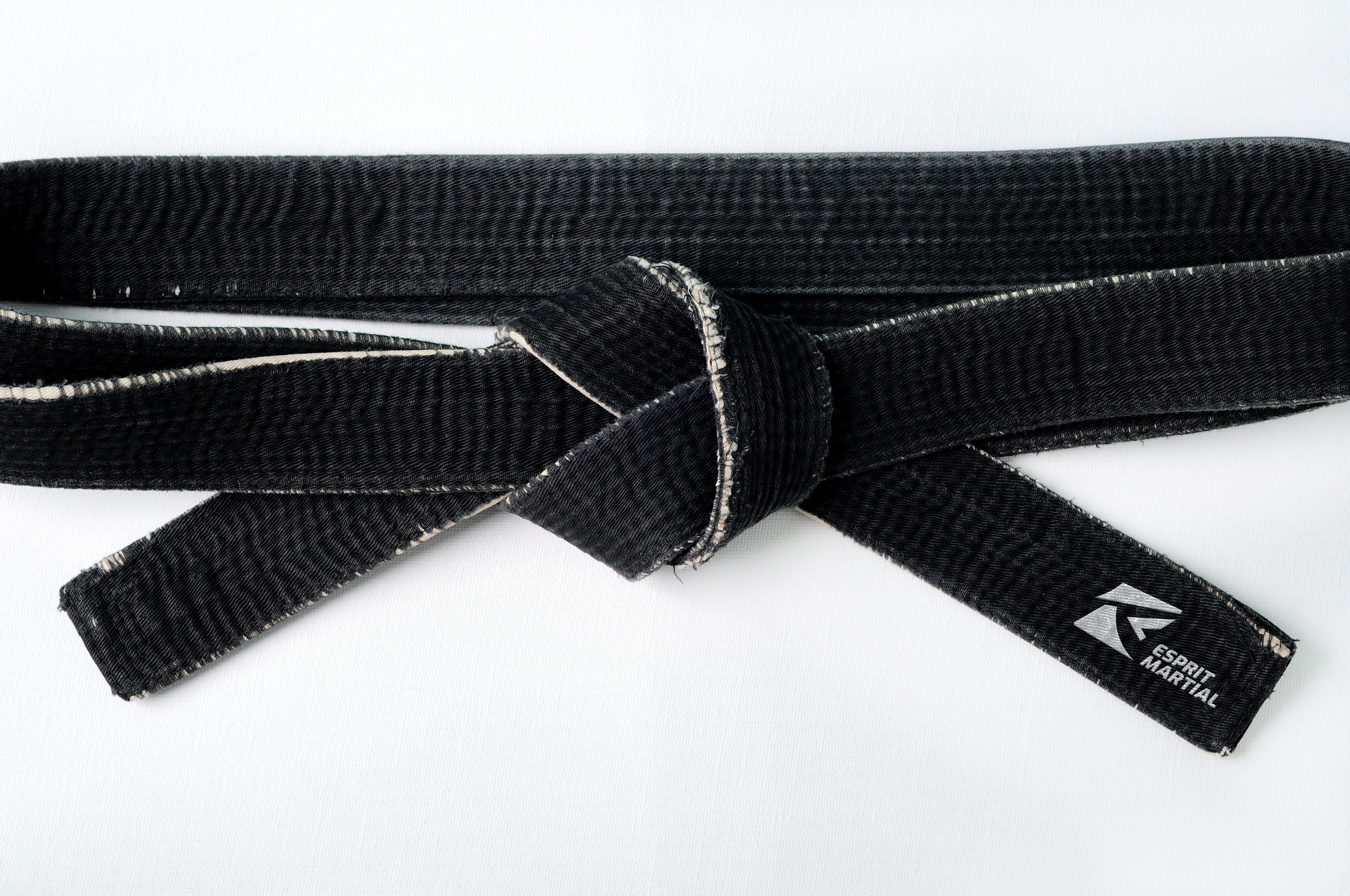
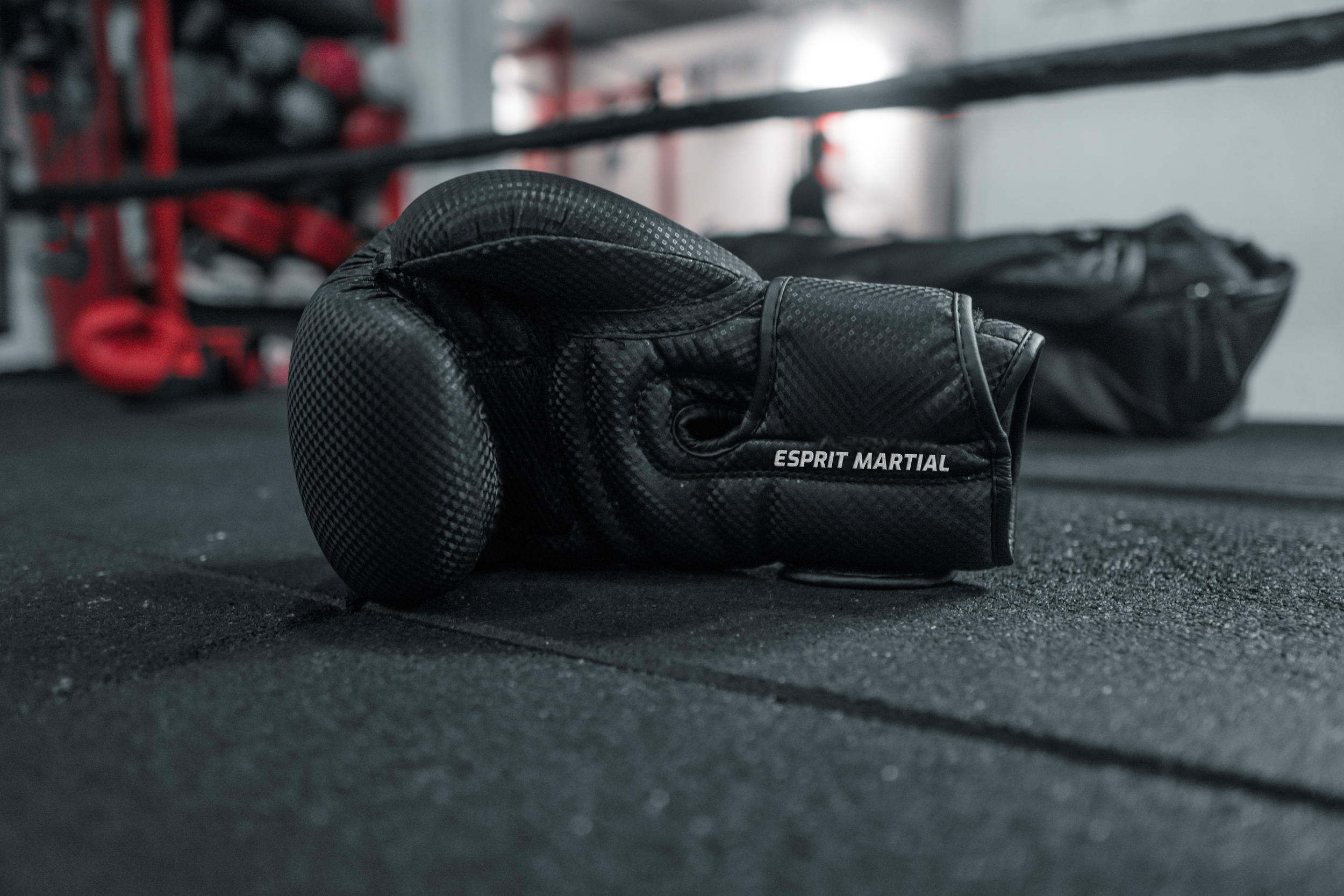
A northern France renovation company needed an identity that felt both solid and modern — trustworthy enough for homeowners, sharp enough to stand out on a job site. The mark combines a geometric H with architectural structure, declined across two logo systems: a bold wordmark for signage and vehicles, a circular badge for workwear. Deployed across fleet, PPE, and branded apparel.